This panel may show a sampled measurement (e.g., power) and/or a cumulative measurement (e.g., energy generated).
When the sampled measurement is available, a gauge and trend chart will appear.
When the cumulative measurement is available, its value will be shown over the date range indicated.
AC power
Cumulative energy generated
AC Power
|
Energy Generated
|
|
---
kWh
|
AC Power (kW)
|
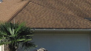
A house is being used for testing and demonstrating controllable distributed energy resources: rooftop PV system, heat pump water heater, HVAC system, and pool pump. The house's main power is the combined power from all household electric loads and the rooftop PV system. The house's main power could flow backwards to the power grid if the solar power exceeds the power needed to run all of the household electric loads.
Swipe or drag the row of tiles left and right or use the left/right "< >" arrows to see all available tiles.
Tap or click a tile to view more information and data.
Gauges show sampled measurements associated with each tile.
Chart (or charts) shows trends among comparable components. Each data point represents an aggregated value for the time interval indicated (e.g., 15-minute average).
Tap or click on the chart titles (if more than one shown) to switch the view between charts. The title of the displayed chart is highlighted in orange.
To zoom in on and get a closer view of a plot area in a chart:
Tap or click on a legend item (if more than one shown) to hide or show its data in the plot area.
These components appear in at least one chart (indicated in the legend):
Chart (or charts) includes one or more of the following measurements (indicated in the legend or title):
Chart (or charts) shows trends among comparable components. Each data point represents an aggregated value for the date indicated.
Tap or click on the chart titles (if more than one shown) to switch the view between charts. The title of the displayed chart is highlighted in orange.
To zoom in on and get a closer view of a plot area in a chart:
Tap or click on a legend item (if more than one shown) to hide or show its data in the plot area.
These components appear in at least one chart (indicated in the legend):
Chart (or charts) includes one or more of the following measurements (indicated in the legend or title):
Chart (or charts) shows trends among comparable components. Each data point represents an aggregated value for the month indicated.
Tap or click on the chart titles (if more than one shown) to switch the view between charts. The title of the displayed chart is highlighted in orange.
To zoom in on and get a closer view of a plot area in a chart:
Tap or click on a legend item (if more than one shown) to hide or show its data in the plot area.
These components appear in at least one chart (indicated in the legend):
Chart (or charts) includes one or more of the following measurements (indicated in the legend or title):