This panel may show a sampled measurement (e.g., power) and/or a cumulative measurement (e.g., energy generated).
When the sampled measurement is available, a gauge and trend chart will appear.
When the cumulative measurement is available, its value will be shown over the date range indicated.
AC power
Cumulative net energy generated (energy generated minus energy consumed)
AC Power
|
Net Energy Generated
|
|
---
kWh
|
AC Power (kW)
|
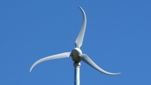
A wind turbine with a 70-ft monopole is located at the overlook area. This turbine has a capacity output of 2.4 kW and produces power by converting rotational motion into electricity. It produces maximum power at 20 mph and can survive 140 mph winds. Its three blades (rotor) sweep in a 12-ft diameter circle.
Chart (or charts) shows trends for a specific component. Each data point represents an aggregated value for the time interval indicated (e.g., 15-minute average).
Tap or click on the chart titles (if more than one shown) to switch the view between charts. The title of the displayed chart is highlighted in orange.
To zoom in on and get a closer view of a plot area in a chart:
Tap or click on a legend item (if more than one shown) to hide or show its data in the plot area.
Chart (or charts) includes one or more of the following measurements (indicated in the legend or title):
Chart (or charts) shows trends for a specific component. Each data point represents an aggregated value for the date indicated.
Tap or click on the chart titles (if more than one shown) to switch the view between charts. The title of the displayed chart is highlighted in orange.
To zoom in on and get a closer view of a plot area in a chart:
Tap or click on a legend item (if more than one shown) to hide or show its data in the plot area.
Chart (or charts) includes one or more of the following measurements (indicated in the legend or title):
Chart (or charts) shows trends for a specific component. Each data point represents an aggregated value for the month indicated.
Tap or click on the chart titles (if more than one shown) to switch the view between charts. The title of the displayed chart is highlighted in orange.
To zoom in on and get a closer view of a plot area in a chart:
Tap or click on a legend item (if more than one shown) to hide or show its data in the plot area.
Chart (or charts) includes one or more of the following measurements (indicated in the legend or title):
Chart (or charts) shows aggregated values for the date range indicated.
Tap or click on the chart titles (if more than one shown) to switch the view between charts. The title of the displayed chart is highlighted in orange.
To zoom in on and get a closer view of a plot area in a chart:
Tap or click on a legend item (if more than one shown) to hide or show its data in the plot area.
Chart (or charts) includes one or more of the following measurements (indicated in the legend or title):